Call Sales: +1 (833) 437-3835
Call Sales: +1 (833) 437-3835
Revel | November 8, 2017 |
In our latest feature release, 2.31, we have updated the look and feel of your Revel POS. Working closely with Apple to update, the new UI provides you with the best-in-class interface to reduce friction, enhance the user’s experience, and align our platform more closely to the familiarity of Apple’s core form and functionality.
We've made big updates to the look, but don't worry, all of the tools you regularly use are still available, in fact, they have been updated for efficiency.
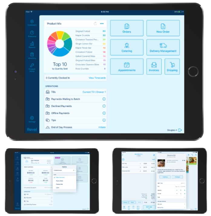
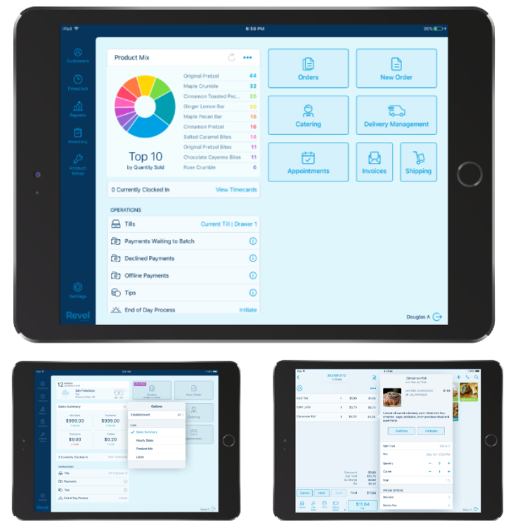
The dashboard was designed to help you get the key reporting information you need right from the POS in real time. Further, you will see additional improvements to the POS layout to help you perform actions with fewer taps – making your team more efficient.
So how is this different from our 2.25 release?
Below are some examples of your updated interface:
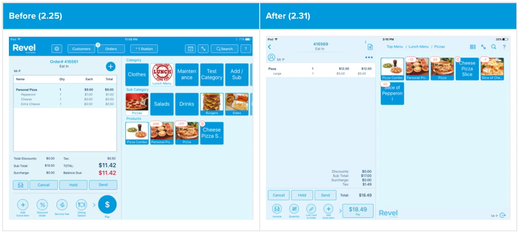
(Main order screen)
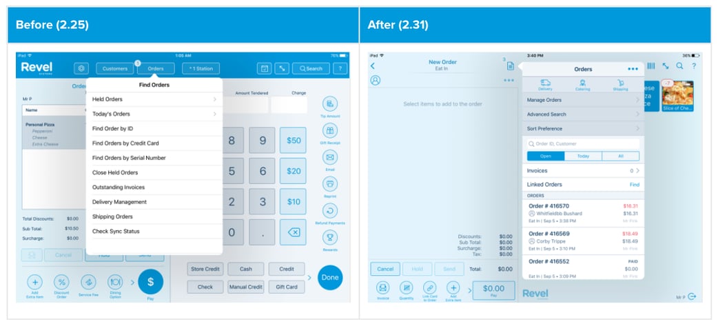
(Payment screen)
In addition to updating the UI of the POS dashboard, we also updated Management Console interface. Of note, the redesigned Sales Summary Report affects the Liabilities and Payments sections in the operations Report. We moved Applied Deposits, House Account Payments, and Gift/Store Credit Payments out of the Payment section of the Operations Report and placed them into the Liabilities table. (Pictured below)
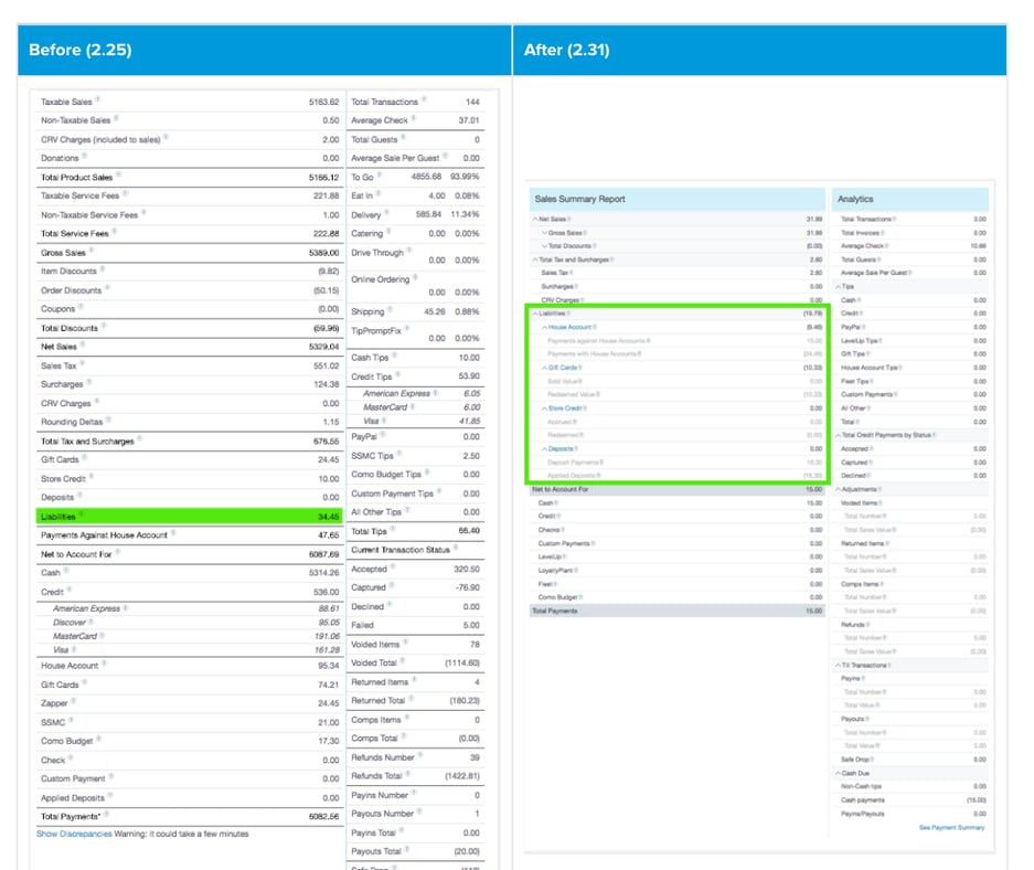
(Sales Summary Report: Liabilities Section)
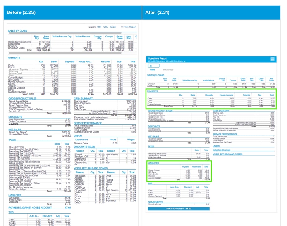
(Operations Report: Payments & Liabilities)
By enhancing our UI we are making it easier than ever to navigate, ensuring that you can run your business efficiently and effectively. Want to see what else is new from the 2.31 release? Check out our article “What’s New From The 2.31 Update?” or read our full release notes here.